TradingView Heatmap: The Ultimate Data Visualization Tool
The TradingView heatmap is a powerful tool that visualizes market data in an intuitive way. TradingView offers a stock, crypto, and forex heatmap, and they are some of the best available online.
TradingView Heatmap Introduction
One of the most popular and useful data visualization tools for traders is the TradingView heatmap. The heat map shows the performance of stocks, forex, and cryptocurrencies in real-time using color-coded cells. TradingView’s heatmaps allow you to:
- Compare the performance of different asset classes, sectors, countries, and indicators
- Easily determine which sectors are performing better than others
Benefits of the TradingView Heatmap
The TradingView heatmap has many benefits for traders, such as:
- It helps you quickly identify the market sentiment and the direction of the price movements. You can see at a glance which assets are rising or falling, which sectors or countries are outperforming or underperforming, and which indicators are bullish or bearish.
- You can use the heatmap data to assess your exposure to different markets and factors, such as sector risk, country risk, or indicator risk. You can also use the heatmap data to balance your portfolio by adding or removing assets that complement or hedge your existing positions.
How to Access and Navigate the TradingView Heatmaps?
Here are the links to TradingView’s stock, crypto, and forex heatmaps:
TradingView Cryptocurrency Heatmap
You can also access the TradingView heatmap from the TradingView website or app.
How to Access the TradingView Heatmap on Desktop
- Go to the footer, then Products > Heatmaps > Stock or Crypto.
- From the homepage, you can also access the heatmap by going to Products > Screeners
How to Access the TradingView Heatmap on Mobile
- To access the TradingView heatmap from the mobile app, tap on More > Stock Heatmap or Crypto Coins Heatmap.
How to Interpret and Analyze the TradingView Heatmap?
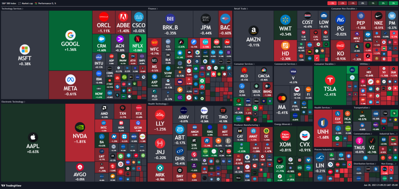
To interpret and analyze the TradingView heatmap, you need to understand how to read the colors and the cell sizes of the heatmap. The colors indicate the percentage change of the price of each asset over a selected timeframe.
The cell sizes represent the market capitalization or the volume of each asset. The brighter or darker the color, the higher or lower the percentage change. The larger or smaller the cell size, the bigger or smaller the market cap or volume.
To use the TradingView heatmap to identify patterns and trends in the market, you need to look for:
- Clusters: These are groups of similar colors or cell sizes that indicate a strong correlation or divergence among assets. For example, a cluster of green cells indicates that a group of assets are rising together, while a cluster of red cells indicates that a group of assets are falling together.
- Outliers: These are cells that have a different color or cell size from the rest of the heatmap that indicate a significant deviation or volatility among assets. For example, an outlier with a bright green color indicates that an asset is surging in price, while an outlier with a dark red color indicates that an asset is plunging in price. An outlier with a large cell size indicates that an asset has a high market cap or volume, while an outlier with a small cell size indicates that an asset has a low market cap or volume.
- Gradients: These are transitions from one color to another that indicate a gradual change or momentum among assets. For example, a gradient from green to red indicates that an asset is losing its upward momentum and turning bearish, while a gradient from red to green indicates that an asset is gaining its downward momentum and turning bullish.
The main components of the TradingView Heatmap interface are:
- The asset selector: This lets you choose between stocks and cryptocurrencies. You can also switch between different indices, such as S&P 500, Dow Jones, Nasdaq 100, etc., for stocks, or different coins, such as Bitcoin, Ethereum, Litecoin, etc., for cryptocurrencies.
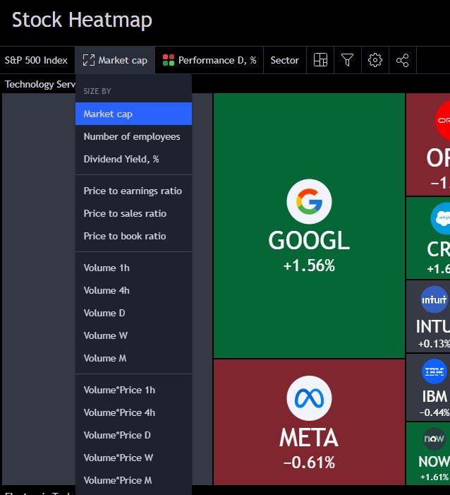
- The filter menu: This allows you to sort and filter the assets by various criteria, such as index, sector, country, timeframe, performance, volume, market cap, etc.
- The heatmap display: This shows the color-coded cells of the assets. You can zoom in or out by using the mouse wheel or pinch gesture. You can also drag the heatmap around by using the mouse click or touch gesture.
- The legend: This explains the meaning of the colors and the cell sizes. The colors indicate the percentage change of the price of each asset over a selected timeframe. The cell sizes represent the market capitalization or the volume of each asset. The brighter or darker the color, the higher or lower the percentage change. The larger or smaller the cell size, the bigger or smaller the market cap or volume.
- The tooltip: This provides more details about each asset when you hover over it. You can see the name, symbol, price, percentage change, market cap, and volume of the asset. You can also click on the asset to open its chart or add it to your watchlist.
How to Customize and Optimize the TradingView Heatmap?
You can customize the TradingView heatmap to suit your personal preferences and trading goals by changing the following options:
- The asset class, index, sector, country, or indicator that you want to analyze. You can choose between stocks and cryptocurrencies, and switch between different indices, sectors, countries, or indicators for each asset class.
- The timeframe, performance, volume, or market cap that you want to compare. You can select different timeframes, performance ranges, volume levels, or market cap sizes for each asset class.
- The color scheme, intensity level, or cell size ratio that you want to view. You can choose between different color schemes, intensity levels, or cell size ratios for each asset class.
Understanding TradingView’s Heatmaps | Bottom Line
The TradingView heatmap is a powerful data visualization tool that shows the performance of stocks and cryptocurrencies in real-time using color-coded cells. It allows you to:
- Quickly identify the market sentiment and the direction of the price movements
- Compare the performance of different asset classes, sectors, countries, and indicators
- Discover new trading opportunities and potential entry and exit points
- Manage your risk and diversify your portfolio
You can access the TradingView heatmap from the TradingView website or app, and customize it to suit your personal preferences and trading goals.
Heatmaps are valuable tools for traders who want to boost their trading performance by visualizing the market data in an intuitive way.
If you want to start using TradingView Heatmap and explore its features and benefits, you can sign up for a free account on TradingView today. New users can usually enjoy a free trial and a discount when they use my link to sign up!
FAQ
Does TradingView have a heat map?
Yes, TradingView has a heat map feature that shows the performance of stocks, forex, and cryptocurrencies in real-time using color-coded cells. You can access TradingView Heatmap from the TradingView website or app and customize it to suit your personal preferences and trading goals. You can also learn more about Tradingview in our complete tutorial.
What is a stock heat map?
A stock heat map is a data visualization tool that shows the performance of stocks in real-time using color-coded cells. Each cell represents a stock and its color indicates the percentage change of its price over a selected timeframe. The cell size represents the market capitalization or the volume of the stock.
Which heatmap is best for trading?
The best heatmap for trading depends on your trading style, objectives, and preferences. However, some general criteria that you can use to evaluate a heatmap are:
- The accuracy and reliability of the data
- The variety and flexibility of the options and features
- The ease of use and accessibility of the interface
- The compatibility and integration with other trading tools and platforms
Based on these criteria, TradingView Heatmap is one of the best heatmaps for trading, as it offers:
- Real-time and historical data from reliable sources
- A wide range of options and features to customize and optimize your heatmap experience
- A user-friendly and intuitive interface that works on any device
- A seamless integration with other trading tools and indicators on TradingView
How do you read a stock heatmap?
To read a stock heatmap, you need to understand how to interpret the colors and the cell sizes of the heatmap. The colors indicate the percentage change of the price of each stock over a selected timeframe. The cell sizes represent the market capitalization or the volume of each stock. The brighter or darker the color, the higher or lower the percentage change. The larger or smaller the cell size, the bigger or smaller the market cap or volume.
Get Your Free Trading Resources
Grab the free trading journal template plus the same tools we use to stay organized, consistent, and objective.
- Free trading journal template
- Custom indicators, watchlists, and scanners
- Access our free trading community
Enter your email below to get instant access.
No spam. Unsubscribe anytime.


