TradingView TPO Charts Explained (TradingView Market Profile)
The market profile is an advanced indicator that displays a combination of time spent and volume traded at each price level. It is generally only applicable to day traders, but it can also be used to determine optimal entry and exit points for swing trading.
In this comprehensive guide, we’ll explore the the history, concepts, and use cases of market profile for traders. We’ll also compare it to the volume profile and explain how you can access these indicators on TradingView.
Join for FREE: Access tons of free educational material!
Don’t miss out – Join now and start learning!
- Free Educational Material
- Community for Like-Minded Traders
- Personalized Trading Education
How to Access the TPO Charts on TradingView
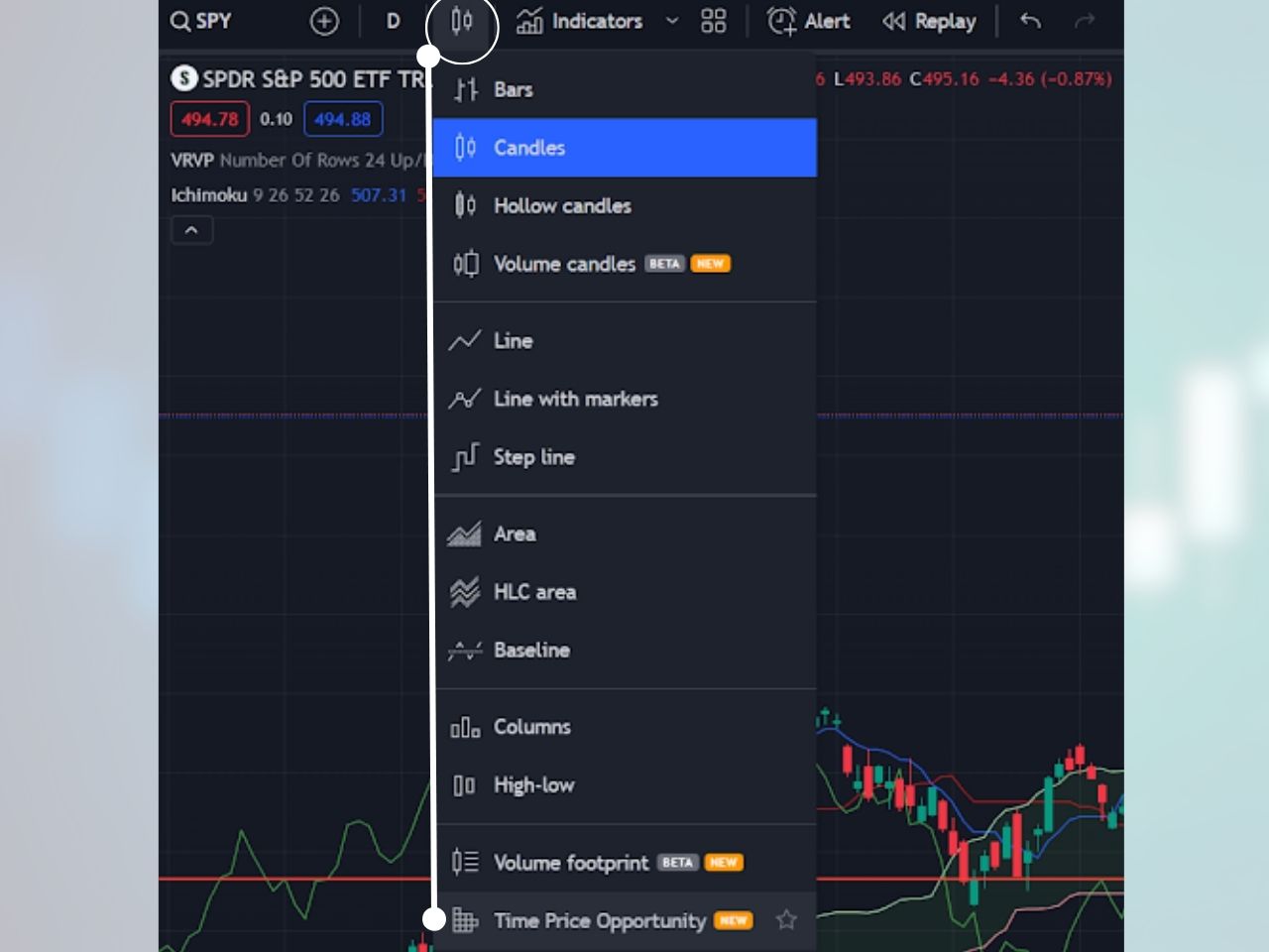
The market profile on TradingView is a chart type called “Time Price Opportunity.” Here is how you can add it to your chart:
1- Click on the chart type at the top left of a TradingView chart, right to the left of indicators
2- Click “Time Price Opportunity,” and the market profile will be added to your chart
Customizing the Market Profile Settings on TradingView
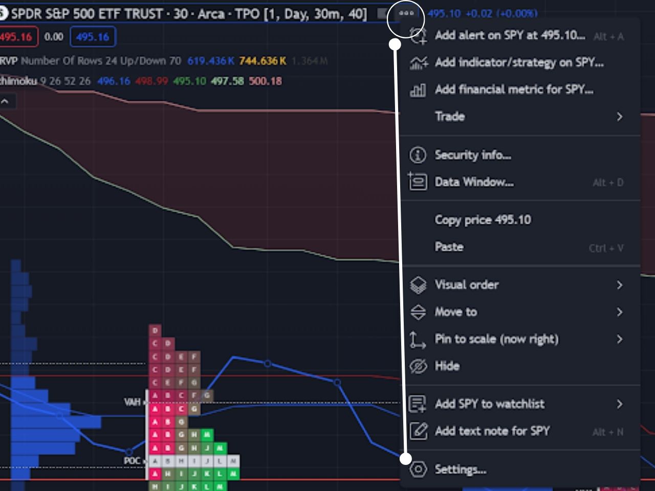
You can customize many aspects of the market profile by hovering over the symbol at the top left corner, clicking the three dots, and then clicking settings in the drop-down menu. You can customize the period length, block size, row size, value area, and more.
The Time Price Opportunity chart is only available for Premium members and up, but you can get a TradingView free trial using my affiliate link to test it out for free before you pay.
Exclusive Deal: 30-Day FREE Premium Access + Bonus Credit
Don’t Miss Out – Sign up for TradingView Now!
- Advanced Charts
- Real-Time Data
- Track all Markets
How Does the Market Profile Work?
The time price opportunity chart on TradingView consists of several components, including the time price opportunity and the volume profile, which work together to form the market profile.
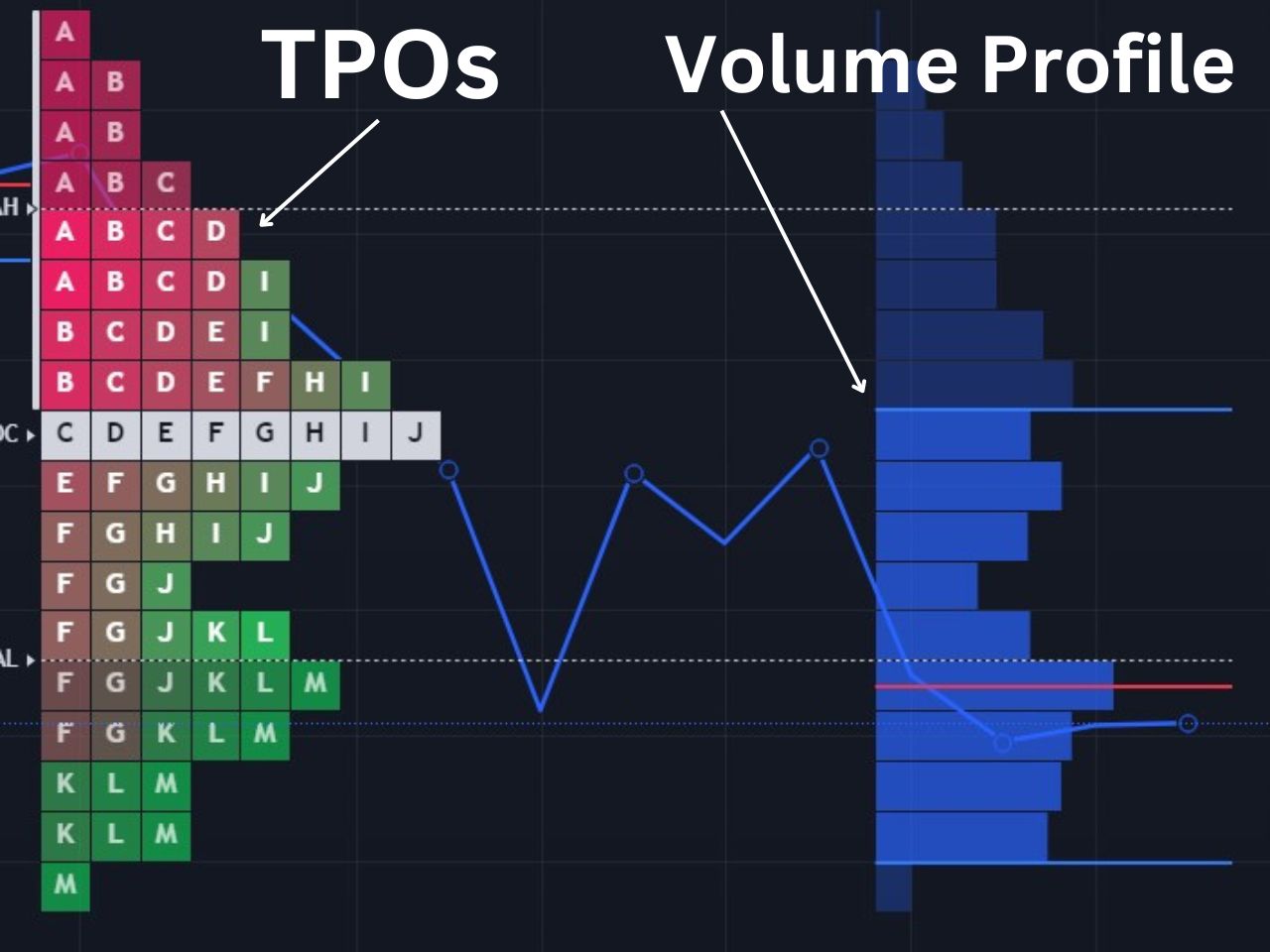
Time Price Opportunities (TPOs)
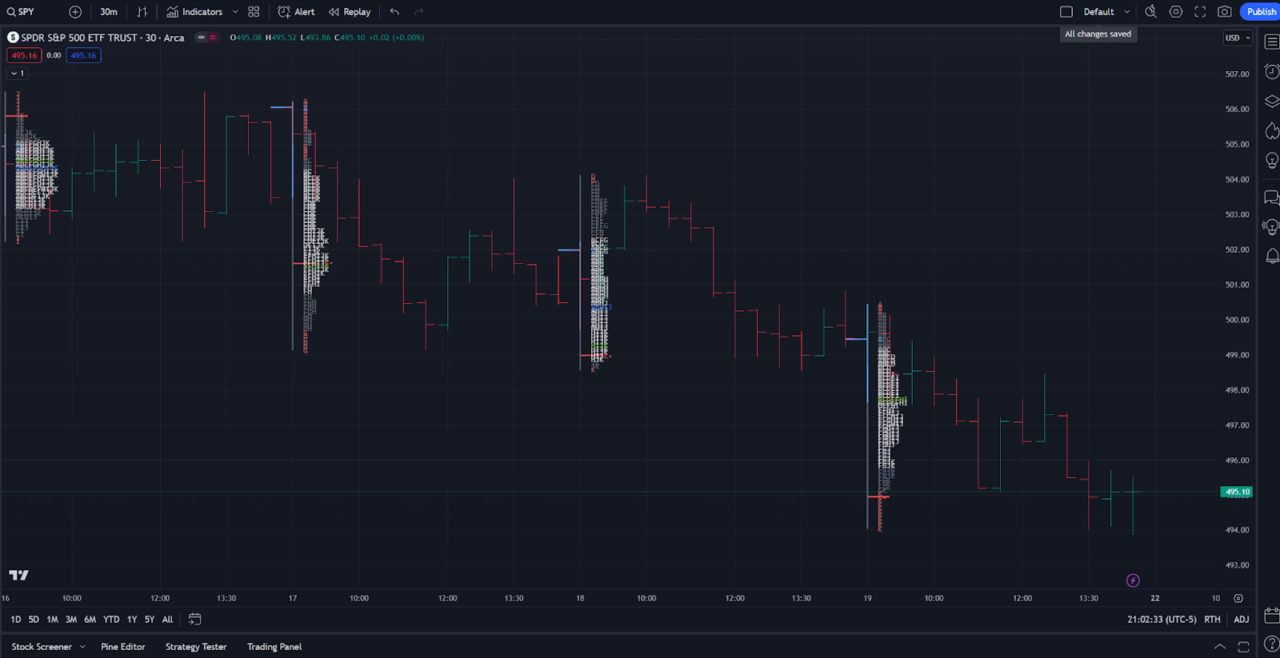
Each of the blocks in the image below are TPOs, which stack based on how much time is spent at a specific price level. Each letter represents a specific time period, which is usually set to 30 minutes, as recommended by the founders of the market profile. For example, A would be the first 30 minutes of the market, and any price level an A is present, the asset traded at within the first 30 minutes.
Time Point of Control (TPOC)
The point of control is the price level which the price has spent the most time at. It is essentially the levels where the most TPOs exist, meaning the price has traded at the level for longer than any other for that day.
Value Area
The value area consists of the price levels in which 70% or more of the time spent has occurred. The top of the value area is referred to as the value area high (VAH), and the bottom of the value area is known as the value area low (VAL).
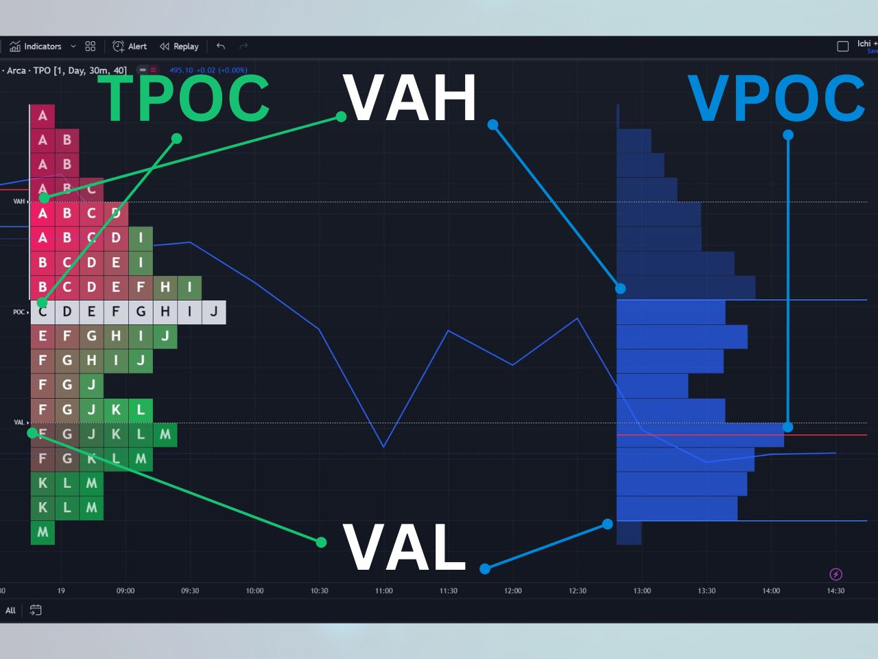
Volume Profile
The volume profile is part of the market profile and consists of mostly the same components, except it is based on volume rather than time. The volume profile is set on the right side of the price action on TradingView, while the time price opportunity chart is on the left side. Here are the components of the volume profile:
Volume Point of Control (VPOC)
The VPOC is the price level at which the most trading volume has occurred. It is similar to the TPOC but tracks volume rather than time.
Volume Profile Value Area
The volume profile also consists of a value area, except it is based on where 70% of the volume has traded rather than time. The value area high (VAH) is the top of the value area, and the value area low (VAL) is the bottom of the value area. Price levels outside of the value area consist of the remaining 30% of volume activity not included in the value area.
Reading the Market Profile
The market profile can form a few significant types of patterns that determine optimal trading opportunities. Examples of these patterns include:
Single Prints
A single print is any part of the market profile that is only a single TPO wide. The idea with a single print is that very little time is spent at these price levels, and it should act as strong support or resistance.
Poor High
A poor high occurs when the market reaches a high point of a trading day and pulls back at least two times, with two different TPO periods (letters). The following must be true to signify a poor high:
- There are two TPO periods (letters) at the top of the range
- There are at least two to three columns of TPOs forming a flat-looking top
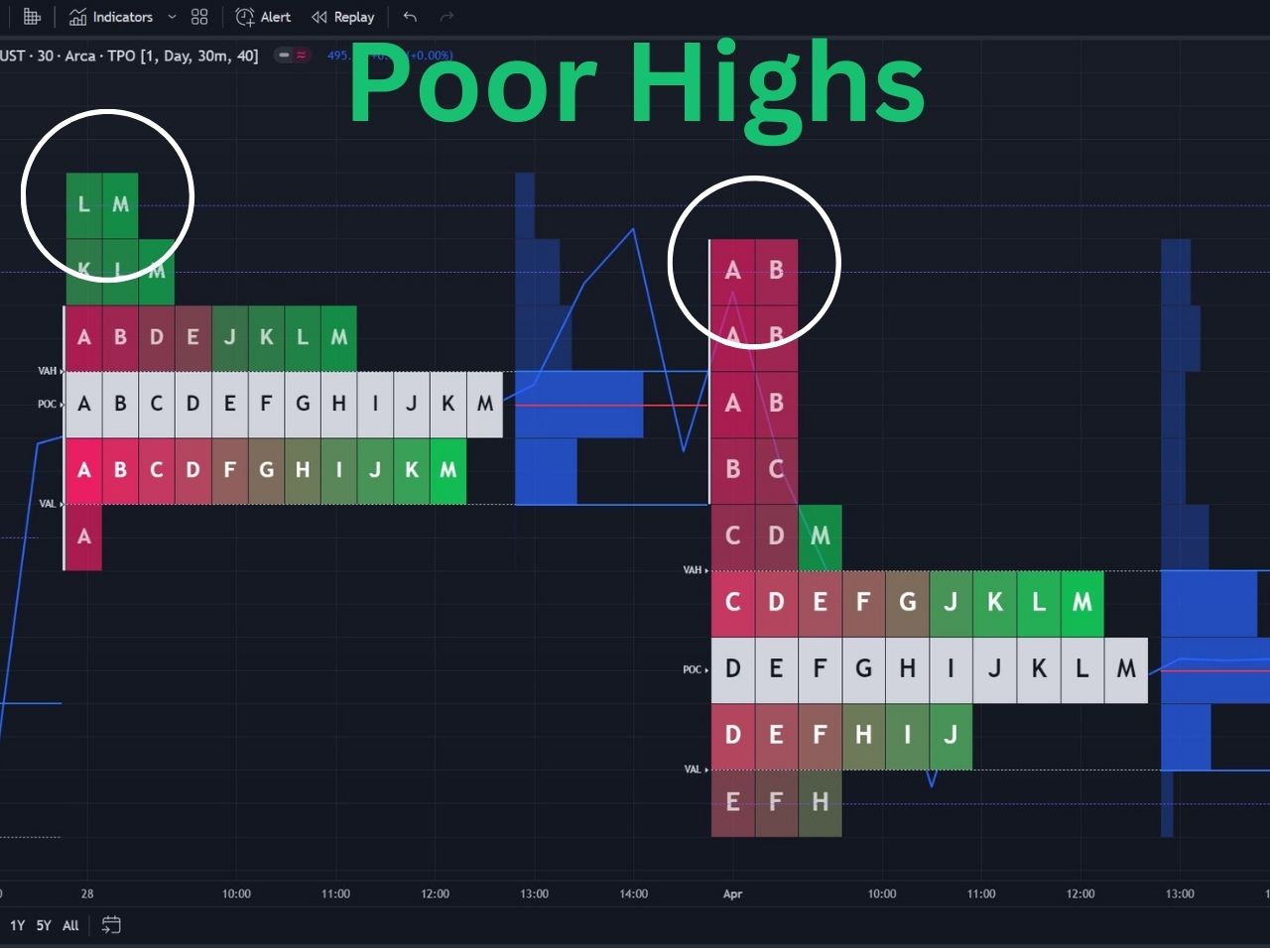
Implications of Poor Highs
A poor high can imply a couple of scenarios:
- Longs are trapped at the high of the day and exit their positions at breakeven when the high is reached, causing the price to retract back down.
- When poor highs are visited in future sessions, there is a strong chance price breaks higher to repair itself since poor highs lack symmetry and are not considered to be a proper market structure.
You can toggle the poor high setting on in the time price opportunity setting on TradingView so it can automatically detect them for you, which are signified by a dotted purple line.
Poor Low
A poor low occurs when the market reaches a low point of the day, then moves back up, and revisits the low a second time within a different TPO period. It is the same as a poor high except it occurs at the low of a trading day. The following must be true to signify a poor low:
- There are two TPO periods (letters) at the bottom of the range
- There are at least two to three columns of TPOs forming a flat-looking bottom
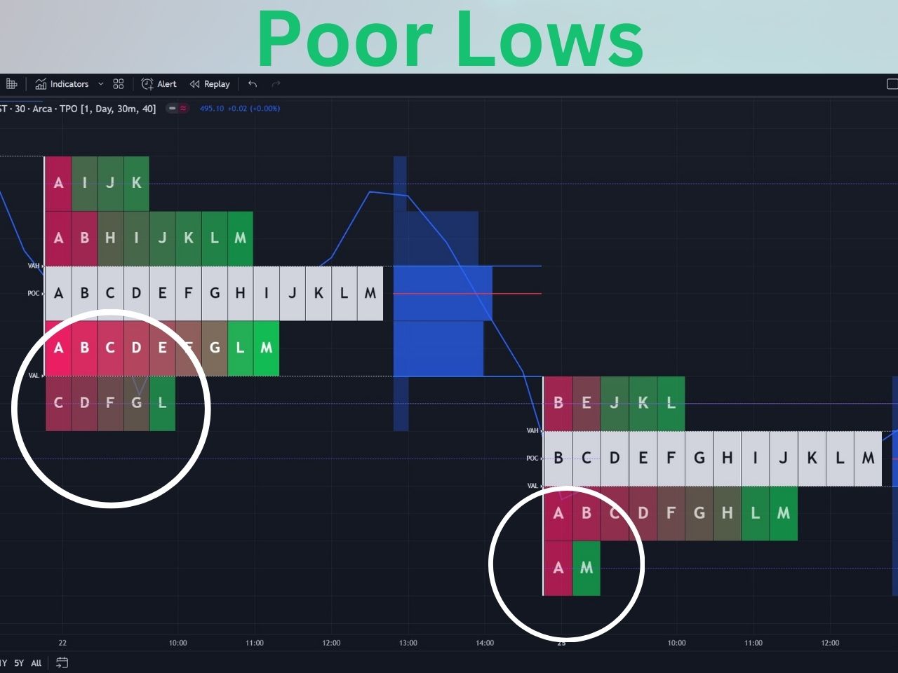
You can toggle the poor low setting on in the time price opportunity setting on TradingView so it can automatically detect them for you, which are signified by a dotted purple line.
Implications of Poor Lows
A poor low implies a couple of scenarios:
- Shorts are trapped at the poor low and may buy their positions back at breakeven, causing prices to move higher.
- If a poor low is revisited in a future session, there is a good chance it will repair itself and break lower since poor lows are not considered a symmetrical market structure.
Excess High
An excess high is when there are at least two single prints at the high of the market profile structure. Excess highs are formed when the price moves up and quickly comes back down. Excess highs are normally where long candle wicks form. An excess high is the exact opposite of a poor high, since little time is spent at these price levels.
Excess Low
An excess is signified by at least two single prints at the low of a market profile structure. On a standard candlestick chart, there will normally be a long wick here on a 30-minute candle. Excess lows are the exact opposite of poor lows since very little time is spent at the price level, and there is only one column of TPOs.
Market Profile vs. Volume Profile
There isn’t necessarily a difference between the volume profile and the market profile, as the volume profile is simply one component of the market profile. The market profile is made up of two components:
- Time Price Opportunity
- Volume Profile
The combination of time price opportunity and the volume profile form the market profile. You can learn more about the TradingView volume profile in my full article about it.
Practical Applications for Traders
The market profile is a versatile tool that can be applied in various trading scenarios:
- Day Trading: Short-term traders can use the market profile to identify areas of value and high-volume trading zones.
- Big Players: The market profile provides insights into the actions of big buyers and sellers, helping traders follow the “big sharks” in the market.
- Auction Dynamics: Understanding the concepts of “Poor Highs” and “Poor Lows” helps traders make informed decisions based on auction dynamics.
Consider watching my video on the TradingView TPO charts for a visual guide as well:
How to Use the Market Profile for Free on TradingView
Since the time price opportunity chart on TradingView requires a premium subscription, you can check out the RS Market Profile custom indicator to access a similar feature for free. It offers many of the same benefits of the native indicator, but it is much less intuitive.
History of the Market Profile
The origins of Market Profile can be traced back to the trading floors of the Chicago Board of Trade (CBOT). It was here that the legendary trader J. Peter Steidlmayer developed this innovative charting technique in the early 1980s. Made public in 1985, the market profile quickly garnered acclaim for its ability to provide traders with unique insights into market behavior.
The market profile is based on the auction market theory, which signifies that buyers and sellers cause imbalances, and that markets eventually return to the fair value. The fair value in the market profile is signified as the point of control, including the volume and time point of control (VPOC & TPOC).
The Bottom Line: Mastering Market Profile Trading Strategies
The market profile is a highly complex indicator, and not many traders completely understand its full potential. The pioneers of the market profile chart are J. Peter Steidlmayer, Steven B. Hawkins, and Jim (James) Dalton, I recommend you look into the following books to learn more about it, which are my Amazon affiliate links:
- Steidlmayer on Markets: Trading with Market Profile, 2nd Edition by J. Peter Steidlmayer
- Markets and Market Logic by J. Peter Steidlmayer
- Markets in Profile by Jim Dalton
- Mind Over Markets by Jim Dalton
Here are some great video resources to watch as well:
– Free trading journal template & cheat sheet PDFs
– Access our custom scanners and watchlists
– Access our free trading course and community!


