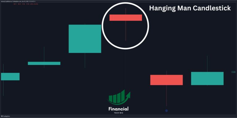
The inverse cup and handle pattern is a bearish variation of the traditional cup and handle pattern.
Is the Inverse Cup and Handle Pattern Bullish or Bearish?
The Inverse Cup and Handle, or the inverted cup and handle, is a bearish reversal pattern that typically appears during an uptrend.
Not only does it signal a potential downtrend, but it also indicates a shift from bullish to bearish sentiment. To be specific, this pattern is undeniably bearish in nature.
Identifying an Inverse Cup and Handle Pattern
The Inverse Cup and Handle consists of two key components:
The Cup: Characterized by an inverted U-shape or rounded top, the cup forms as the price experiences a decline.
The Handle: Following the cup, the handle emerges through a consolidation period or small upward price movement.
Together, these components paint a pattern resembling an upside-down teacup.
Best Timeframe for an Inverted Cup and Handle
The Inverse Cup and Handle can manifest over varying time frames but is most commonly observed on daily or weekly charts.
Depending on the asset being traded and prevailing market conditions, the pattern’s formation can span from several weeks to months.
Post-Pattern Price Movement
Upon the pattern’s completion, traders focus on the neckline—the resistance level at the top of the cup. A breakout below the neckline (top of the cup) is a strong bearish signal, often accompanied by a surge in trading volume. This breakout paves the way for a potential downtrend, with traders considering short positions.
How to Trade the Inverse Cup and Handle Pattern
The proper time to enter a short position based on the inverse cup and handle pattern is when the price breaks below the handle.
Once you place your short position, you must determine where to set your stop-loss and take-profit orders.
When to Take Profit
The target for the inverse cup and handle is the difference between the top of the cup and the breakout level. For example, if the distance between these two levels is $20, you will set a limit order to take profit when the stock falls 20 points below the handle.
Where to Set Your Stop
Depending on your risk tolerance, you can set a stop-loss below the cup or the handle. The pattern is no longer valid if the price fails to break below either.
The Stages of the Inverse Cup and Handle:
The Breakout: The short sale point occurs when the price breaks below the support level formed by the handle’s lower boundary. A strong breakout with increased volume is a positive sign.
Price Targets: After the breakout, traders can estimate potential price targets by measuring the height of the cup and projecting it downward from the breakout point.
Risk Management: Implementing stop-loss levels above the handle’s resistance or at a predetermined percentage is essential for managing risk.
Inverse Cup and Handle Example on QQQ ETF
The Inverse Cup and Handle pattern was evident on the QQQ ETF at the end of 2021, as seen on the daily timeframe.
You can clearly see the inverted cup and handle on the chart below, especially after using some drawing tools on TradingView.
If you wanted to take this trade, you would short when the price broke below the trendline furthest to the right. For practice, go take a look at the QQQ chart in 2021 on the daily timeframe on TradingView and see if you can spot it yourself!
Chart Analysis with Precision: TradingView
If you aren’t already, consider signing up for a free TradingView account. TradingView is one of the best charting platforms available by far and is perfect for spotting patterns and offers tons of technical indicators.
With our affiliate link, you get a discount and a 30-day free trial for the premium features as well.
Contrasting with the Cup and Handle: The Bullish Counterpart
Understanding the Inverse Cup and Handle pattern is a stepping stone to informed trading. As traders navigate the financial markets, recognizing and understanding chart patterns like the Inverse Cup and Handle becomes a valuable skill.
These patterns offer insights into potential price movements and enable traders to make strategic decisions aligned with market trends. However, it’s important to remember that no chart pattern guarantees success, and trading always carries inherent risk.
This article contains affiliate links I may be compensated for if you click them.
This article will explore my favorite charting software for stocks, and give you a basic overview of the various features offered. My favorite overall charting software for stocks is TradingView, as it offers free real-time data whenever possible, and allows you to track all assets from a single platform. You can read more in my full review of TradingView.
TradingView is the best charting software for stocks because it does everything for a great price. From advanced indicators like the volume profile to backtesting, TradingView has you covered. It also provides intraday charting for free, you just need to sign up for an account.
TradingView has several features, including:
An extensive library of technical indicators
Customizable charts and drawing tools
Real-time data and alerts
Community-made custom indicators
Seamlessly draw on charts
Stock screeners
Heatmaps
Supports stocks, crypto, forex
Whether you’re a seasoned trader or just getting started, TradingView has something for everyone. With real-time data and several indicators at your fingertips, you can confidently navigate the markets.
Drawing on charts is seamless, and you have every indicator you can imagine. New users can use our affiliate link to get a discount and a free trial of TradingView’s premium trading tools.
TrendSpider is another noteworthy charting software that caters to both novice and experienced traders.
Its unique selling point lies in its automated technical analysis tools, which help streamline the trading process by reducing the time spent on chart analysis.
Key features of TrendSpider include:
Automated Technical Analysis: TrendSpider’s AI-driven system can automatically identify and draw trend lines, Fibonacci levels, and candlestick patterns, making it easier for traders to spot potential trading opportunities.
Dynamic Price Alerts: Users can set alerts based on technical indicators or price movements, ensuring they never miss a key trading moment.
Multi-Timeframe Analysis: This feature allows traders to overlay multiple timeframes on a single chart, providing a more comprehensive view of the market.
Raindrop Charts: A unique feature to TrendSpider, Raindrop Charts are a novel way of visualizing volume and price action, offering insights that traditional candlestick charts may not provide.
Backtesting Capabilities: Traders can test their strategies using historical data, which is crucial for refining trading approaches.
TrendSpider stands out for its emphasis on automation and innovation in charting technology. The platform is particularly beneficial for traders who rely heavily on technical analysis and seek to maximize their efficiency by utilizing automated tools.
Its user-friendly interface, combined with powerful analytical tools, makes it a strong competitor in the realm of charting software.
For traders considering TrendSpider, they offer a free trial, allowing potential users to explore its features before committing to a subscription. You can also get a discount on your subscription when you sign up using our TrendSpider affiliate link.
For a detailed comparison with other platforms like TradingView, check out our comprehensive review of TrendSpider vs. TradingView.
Finviz is a great tool for its quick stock analysis capabilities. After typing in a ticker on Finviz, you will get a quick overview of its chart, fundamentals, and analyst coverage.
However, Finviz charges for intraday charting and isn’t a great choice for technical analysis. TradingView has much better charting and provides intraday charting for free. The bottom line is Finviz is great for a quick glance at a stock but not much for advanced technical analysis.
Key features include:
Automatically draws trend lines
Backtesting capabilities
Stock screener
Quick and efficient fundamental data
For a detailed comparison with TradingView, check out our article on TradingView vs. Finviz.
4- Barchart
Barchart excels with its historical data, which is created from its real-time data feeds, and its APIs make it easy to integrate the data into various applications and platforms. Barchart also offers historical data for technical indicators, bid-ask data, and depth of market.
Barchart also supports various indicators that can be used for free. Overall, Barchart is a solid platform, but TradingView still beats it when it comes to charting.
Key features include:
Several free indicators
Intraday charting
Unusual options activity
Option screener
For insights into Barchart’s strengths and how it compares to TradingView, read our article on Barchart vs. TradingView.
5- StockCharts
StockCharts allows users to create, annotate, save, and share their own custom charts with various indicators, overlays, and timeframes. However, the look feels dated, and it is lacking many charting features that TradingView has. It also does not have intraday chart data available for free.
StockCharts doesn’t seem to excel in either technical or fundamental analysis, but it gets the job done. If you enjoy a vintage feel, StockCharts may suit you. For those looking for a modern and efficient charting platform, consider one of the other tools on the list.
When it comes to charting software, the right choice depends on your trading style and needs. However, TradingView is by far the best for technical analysis.
If you are looking for fundamental data, Finviz and Barchart are your best bet. StockCharts is a bit lacking, in our opinion, but it will still get the job done.
Keep in mind that TradingView’s free trial is an excellent opportunity to try out premium features, including the volume profile, which isn’t available on most charting platforms.
Candlestick patterns play a crucial role in technical analysis, offering valuable insights to traders and investors. Among these patterns, the Hanging Man candlestick pattern stands out as a noteworthy signal, often indicating a potential bearish reversal.
This guide will explore the nuances of the Hanging Man pattern, compare it with similar patterns, and provide practical trading tips.
Understanding the Hanging Man Candlestick Pattern
The Hanging Man pattern is a single-candle bearish reversal pattern characterized by the following features:
A small body located at the top of the candle
A long lower shadow that is at least twice the length of the body
Little or no upper shadow
The real body’s color is unimportant—it can be either green or red. The pattern typically appears after an uptrend or price rise.
A Tale of Two Patterns: Hanging Man vs. Hammer
Though the Hanging Man pattern resembles the Hammer pattern, the two serve different purposes in trading:
Hanging Man: A bearish reversal pattern that occurs after an uptrend. It signals that bears gained control during the trading session, but bulls pushed the price back up, resulting in a long lower shadow.
Hammer: A bullish reversal pattern that occurs after a downtrend. It signals that bulls have regained control and driven the price higher after initial selling pressure. Similar to the Hammer, the Inverted Hammer pattern is a bullish reversal signal that appears after a downtrend.
In summary, the Hanging Man is bearish, while the hammer and inverted hammer are bullish. The hanging man follows an uptrend, while the hammers follow a downtrend.
Gravestone Doji: A Relative of the Hanging Man
Similar to the Hanging Man, the Gravestone Doji is a bearish reversal pattern with a long upper shadow and no real body. The difference lies in the placement of the shadows:
Hanging Man: A long lower shadow and a small body at the top
Gravestone Doji: A long upper shadow and no real body (opening and closing prices are the same)
Both patterns signal potential trend reversals, but the Gravestone Doji is formed after an uptrend and implies that bears have taken control by pushing the price down from its high.
Making Sense of the Hanging Man: Interpretation and Confirmation
A Hanging Man pattern on its own is not a definitive signal; traders should seek confirmation before taking action:
Look for the Hanging Man to form after an upward price trend.
Wait for a confirmation candle on the following day that exhibits a price drop (e.g., a lower close than the Hanging Man’s close).
Consider shorting near the close of the red day following the Hanging Man.
Thomas Bulkowski’s research suggests that Hanging Man patterns with heavy trading volume and longer lower shadows are better predictors of price moving lower.
Practical Tips for Trading the Hanging Man
Trading the Hanging Man pattern requires caution and consideration:
Hanging Man patterns within a third of the yearly high tend to act as continuations of the primary price trend.
Place a stop-loss order above the high of the Hanging Man candle to manage risk.
Use additional technical indicators and tools like TradingView to enhance your analysis.
The Final Word: Treading Carefully with the Hanging Man
The Hanging Man pattern can be a valuable addition to a trader’s toolkit, but its interpretation requires careful analysis and confirmation. Though traditionally seen as a bearish reversal, it can occasionally signal a bullish continuation.
As always, using multiple indicators, staying informed, and making informed trading decisions based on market conditions are essential. Experience and expertise play a crucial role in recognizing genuine Hanging Man patterns and distinguishing them from false signals.
Further Considerations: Limitations and Variable Performance
As with any technical analysis tool, the Hanging Man pattern is not infallible. Empirical research suggests that the Hanging Man pattern may act as a bullish continuation pattern approximately 59% of the time, which is close to random. This variability underscores the importance of considering multiple factors before making trading decisions.
Several factors may contribute to the variable performance of the pattern:
The overall market environment: The broader market context can influence the effectiveness of the pattern. For example, a Hanging Man pattern formed during a strong bullish market may not lead to a significant reversal.
The presence of nearby support and resistance levels: Nearby support levels may halt a potential bearish reversal signaled by the Hanging Man pattern.
News and events: Fundamental factors, such as earnings reports, economic data, and geopolitical events, can override technical signals and affect price movement.
In Conclusion: Harnessing the Subtleties of the Hanging Man
The Hanging Man pattern provides traders with a signal to watch for potential bearish reversals in an uptrend. While the pattern can be a valuable tool, traders must exercise caution, seek confirmation, and consider the broader market context.
By combining the Hanging Man pattern with other technical and fundamental analysis techniques, traders can enhance their decision-making process and confidently navigate the financial markets.
For those seeking to further their knowledge of technical analysis and chart patterns, TradingView offers a comprehensive suite of charting tools, indicators, and resources. With a discount and a 30-day free trial, traders can explore various features and improve their trading strategies.
Whether you’re a seasoned trader or a beginner, understanding the intricacies of candlestick patterns like the Hanging Man is an essential step on the path to successful trading. Keep learning, stay informed, and harness the power of technical analysis to navigate the ever-changing financial markets.
This article contains affiliate links I may be compensated for if you click them.
Heikin-Ashi candlesticks have emerged as a go-to technical trading tool for traders around the globe. Designed to represent and visualize market price data, Heikin-Ashi candlesticks are known for their ability to filter out market noise and provide traders with a clear picture of market trends and direction.
In this article, we’ll take a deep dive into this fascinating technique, exploring its origins, calculations, and practical applications.
A Glimpse into the Heikin-Ashi Technique
The Heikin-Ashi technique hails from Japan and is a modified form of traditional candlestick charts. The term “Heikin-Ashi” is derived from the Japanese words “Heikin,” meaning “average,” and “Ashi,” meaning “bar.” As the name suggests, Heikin-Ashi candlesticks use average price data to create a smoothed chart, making it easier for traders to spot trends and reversals.
Decoding Heikin-Ashi Calculations
To create Heikin-Ashi candles, traders use a specific formula to calculate the modified open, high, low, and close (OHLC) values:
These values are then used to generate Heikin-Ashi candlesticks that provide a clearer representation of market trends.
Identifying Market Trends with Precision
Heikin-Ashi charts simplify the task of identifying market trends. Traders can easily spot uptrends and downtrends by observing the color of the candlesticks:
Uptrend: Characterized by consecutive green candlesticks.
Downtrend: Characterized by consecutive red candlesticks.
The presence of multiple consecutive bars of the same color indicates a strong trend, allowing traders to make informed decisions.
Spotting Trend Reversals with Confidence
Heikin-Ashi charts also provide valuable signals for potential trend reversals. Key reversal signals include:
Doji Candlestick: A candlestick with a small body and long shadows, signaling uncertainty and a possible trend reversal.
Wedge Patterns: Rising and falling wedges can indicate trend reversals based on the direction of the breakout.
Traders should exercise caution when interpreting small-bodied candles, as they may signal a trend pause rather than a reversal.
Advantages and Drawbacks of the Heikin-Ashi Technique
Advantages
Accessibility: Easily available on most trading platforms.
High Chart Readability: Enables easy interpretation of market trends.
Reliability: Provides accurate results using historical data.
Noise Filtering: Filters out market noise for clearer trend identification.
Drawbacks
Time Gap: Use of historical data may result in a delay in real-time trading signals.
Practical Tips for Mastering Heikin-Ashi
To maximize the potential of Heikin-Ashi in trading, consider the following tips:
Combine Heikin-Ashi with other technical indicators for comprehensive analysis.
Use a trailing stop to capitalize on a strong trend.
Pay attention to candlestick color changes, as they may signal a trend reversal.
Heikin-Ashi candles have proven to be a powerful and versatile tool for traders seeking to navigate the dynamic world of financial markets. With their ability to filter out market noise and provide a clear depiction of market trends, Heikin-Ashi charts have become a staple in the toolbox of technical traders.
Whether you’re a seasoned professional or a budding enthusiast, incorporating Heikin-Ashi candlesticks into your trading strategy can enhance your decision-making process and boost your ability to capitalize on market movements. So, as you venture forth into the markets, remember to keep an eye out for those average bars and embrace the insights they have to offer.
This article contains affiliate links I may be compensated for if you click them.
Auction Market Theory (AMT) is a philosophy that offers traders and market participants a unique perspective on the movements of financial markets.
At its core, AMT focuses on the continuous interactions between buyers and sellers, the imbalances that arise, and the subsequent price discovery that occurs in the quest for fair value.
In this guide, we’ll dive into the key concepts of AMT and explore how it can enhance trading decision-making.
Auction Market Theory Explained
At the heart of AMT lies the concept of imbalances between buyer and seller aggression. These imbalances arise due to various market events that influence participants’ actions. As a result, the market experiences fluctuations in price levels as it seeks an equilibrium point.
Fair Value: Central to AMT is the notion of “Fair Value,” the price area where trade is facilitated most efficiently. Here, buyer and seller aggression are closely balanced, resulting in stable trading within a relatively tight price range.
Imbalanced Markets: Imbalances occur when market events prompt either buyers or sellers to dominate the trading landscape. When markets are imbalanced, prices move directionally, and the market enters a discovery phase in search of new value areas.
Balanced Markets: Balanced markets represent a state of equilibrium where prices fluctuate near fair value. In this state, the aggression of buyers and sellers is harmonious, leading to steady trade volume.
Market Profile: Visualizing Market Auctions
To better understand and analyze market auctions, traders often turn to a powerful charting tool known as Market Profile. Developed by Peter Steidlmayer in the early 1980s, Market Profile plots price distribution over time, offering valuable insights into market dynamics.
Market Profile is based on the concept of Time-Price Opportunity (TPO) and comprises three fundamental components: Price, Time, and Volume. The result is a visual representation of the market’s auction process, revealing patterns of herd behavior and the ebb and flow of price over time.
Key Applications of AMT in Trading
Armed with an understanding of AMT, traders can better navigate the financial markets and make informed trading decisions. Here are some practical applications:
Mean Reversion in Balanced Markets: In balanced markets, AMT traders may look to fade moves away from Fair Value. This mean reversion strategy capitalizes on the market’s tendency to revert to a stable price point.
Trend Trading in Imbalanced Markets: When markets are imbalanced, AMT traders may trade in the direction of the imbalance, capturing the market’s directional momentum during the discovery phase.
Analyzing Order Flow and Volume: Traders can use Volume Profile alongside AMT to examine the distribution of trading volume at different price levels. This analysis offers insights into market participants’ actions and potential support and resistance zones.
The Potential of Auction Market Theory
Ultimately, AMT provides traders with a framework to interpret market dynamics, recognize patterns, and make strategic trading decisions. By incorporating AMT into their analysis, traders gain the ability to react to the ever-changing market landscape rather than merely attempting to predict it.
Whether you’re a seasoned trader or new to the financial markets, understanding Auction Market Theory can be a valuable addition to your trading arsenal. With AMT as your guide, you can confidently navigate the market’s constant shifts and unlock a world of trading opportunities.
Leveraging Market Profile and Volume Profile on TradingView
For traders seeking to harness the power of Auction Market Theory, TradingView offers robust tools for visualizing and analyzing market auctions—Market Profile and Volume Profile. These tools allow traders to delve into the distribution of prices and trading volume, providing a deeper understanding of market dynamics.
Market Profile is a charting tool that plots the distribution of prices over time, offering insights into the two-way auction process. Through Market Profile, traders can identify areas of value, high-volume zones, and the ebb and flow of price, enhancing their decision-making process.
On the other hand, Volume Profile focuses on analyzing the distribution of trading volume at different price levels. By analyzing volume distribution, traders can uncover key support and resistance zones, gauge the actions of big buyers and sellers, and assess the strength of market trends.
TradingView offers a custom Market Profile indicator by RunStrat (RS: Market Profile), equipped with features such as marking the Point of Control (POC), calculating the Value Area, and highlighting the Volume-Weighted Average Price (VWAP).
For those interested in exploring Market Profile and Volume Profile on TradingView, we have great news! New users can usually access a 30-day free trial of TradingView’s premium features using our link. Additionally, you can receive a discount on your subscription, providing even more value for your trading journey.
Whether you’re a seasoned trader or just starting, utilizing Market Profile and Volume Profile on TradingView can be a valuable addition to your trading toolkit, unlocking insights into market behavior and potential opportunities.
FAQ
Who created auction market theory?
Pete Steidlmayer developed the auction market theory in the 1980s. Jim Dalton is also known for being the godfather of the market profile and auction market theory.
What is an auction market in simple terms?
An auction market is a market where buyers and sellers compete by placing bids and offers for a certain item or asset. The price of the item or asset is determined by the interaction of supply and demand, as well as the rules of the auction. An example of an auction market is the stock exchange, where traders buy and sell shares of companies.
What is the value area of the auction market theory?
The value area of the auction market theory is the range of prices where most of the trading activity occurs. It represents the fair price or equilibrium price of the item or asset, where buyers and sellers agree on its value. The value area can be identified by using tools such as market profile or volume profile, which show the distribution of volume or time at different price levels.
What are examples of auction theory?
Auction theory can be applied to various situations where resources are allocated through bidding mechanisms. Some examples of auction theory are:
Spectrum auctions, where governments sell licenses to use radio frequencies for telecommunications services.
Treasury auctions, where governments sell bonds or bills to finance their budget deficits.
Art auctions, where collectors bid for paintings or sculptures by famous artists.
Charity auctions are where donors bid for items or experiences to raise money for a cause.
Online auctions, where buyers and sellers trade goods or services on platforms such as eBay or Amazon.
How do you trade auction market theory?
To trade auction market theory, you need to understand the dynamics of order flow and price action in an auction market. You need to identify the balance and imbalance phases of the market, as well as the initiating and responsive activities of buyers and sellers. You also need to recognize the acceptance and failed auction scenarios, which indicate whether the market has found a new value area or rejected a price level. You can use tools such as market profile or volume profile to visualize the structure and behavior of the market.
What are the different types of auction game theory?
Auction game theory is a branch of game theory that studies how bidders strategize and interact in different types of auctions. Some common types of auctions are:
First-price sealed-bid auctions, where bidders submit their bids secretly and the highest bidder wins and pays their bid.
Second-price sealed-bid auctions, also known as Vickrey auctions, where bidders submit their bids secretly and the highest bidder wins but pays the second-highest bid.
English auctions, also known as open ascending price auctions, where bidders openly raise their bids until no one is willing to bid higher.
Dutch auctions, also known as open descending price auctions, where the seller starts with a high price and lowers it until a bidder accepts it.
All-pay auctions, where bidders pay their bids regardless of whether they win or not.
What is auction theory what are its applications?
Auction theory is an applied branch of economics that deals with how bidders act in auction markets and how the features of auction markets incentivize predictable outcomes. Auction theory is a tool used to inform the design of real-world auctions. Some applications of auction theory are:
Designing efficient and fair mechanisms for allocating scarce resources such as spectrum licenses, electricity contracts, carbon permits, etc.
Evaluating the performance and revenue potential of different auction formats and rules.
Analyzing the strategic behavior and incentives of bidders and sellers in various auction settings.
Developing bidding strategies and algorithms for participating in complex auctions.
What is TPO auction theory?
TPO stands for time-price opportunity, which is a way of measuring how much time the market spends at a certain price level. TPO auction theory is based on using market profile, which is a graphical tool that shows the distribution of TPOs across different price levels. TPO auction theory helps traders understand how the market values an item or asset over time, and how it transitions from one value area to another.
Before you go
If you want to keep educating yourself about personal finance, you must check out these posts as well:
The world of technical analysis is replete with fascinating candlestick patterns that traders and investors use to navigate the financial markets. Among these patterns, the inverted hammer stands out as a potential harbinger of a bullish trend reversal.
This article will explore the inverted hammer pattern, its interpretation, and its significance in trading strategies. TradingView offers a powerful charting platform for those keen on technical analysis, complete with a $30 discount and a 30-day free trial when you use my link.
Decoding the Inverted Hammer
The inverted hammer is a single candlestick pattern that typically appears at the bottom of a downtrend. The key characteristics of this pattern include:
Open, low, and close prices that are approximately the same
A long upper shadow/wick, at least twice the length of the real body
A small lower body, which can be either red or green. Even a red hammer candlestick signals a bullish reversal.
This pattern tells a compelling story about the struggle between buyers and sellers in the market.
Interpreting the Signal and Market Psychology
The inverted hammer is regarded as a bullish signal, suggesting a possible reversal from a bearish to a bullish trend. But is an inverted hammer always bullish? And how accurate is it? Let’s explore:
The pattern indicates weakening bearish momentum, with sellers unable to drive prices lower.
Buyers make an attempt to push prices higher, but selling pressure prevents a sustained rally.
The emergence of the pattern at the bottom of a downtrend suggests a shift in market sentiment.
However, traders must exercise caution and seek confirmation before making decisions.
Strategies and Considerations for Trading
When trading based on the inverted hammer, consider the following steps:
Seek confirmation: A bullish candle that exceeds the high of the inverted hammer may confirm a trend reversal.
Use additional indicators: Reinforce your analysis with other technical indicators or support and resistance levels.
Manage risk: Define strict stop-loss levels, typically below the low of the inverted hammer, to mitigate risk.
The win rate of the inverted hammer may vary, so it’s crucial to evaluate the broader market context. For in-depth technical analysis, traders can explore TradingView.
Parallels and Contrasts with Similar Patterns
The inverted hammer bears resemblance to other patterns, such as the doji candle. While the doji has a minimal body, the inverted hammer has a small body with a long upper shadow.
The bullish hammer candle is a bullish reversal pattern, much like the inverted hammer, but with distinct features. The hammer is characterized by a small body and a long lower shadow, indicating a potential reversal to the upside after a downtrend. While both the hammer and the inverted hammer are bullish signals, their appearance and placement in the context of a trend are key differentiators:
The bullish hammer pattern typically appears at the bottom of a downtrend, signaling the potential for a bullish reversal. The defining feature of the hammer is its long lower shadow, which represents the rejection of lower prices by the market.
The inverted hammer also emerges at the bottom of a downtrend and hints at a possible bullish reversal. The inverted hammer is distinguished by its long upper shadow, reflecting the buyers’ attempt to drive prices higher during the period.
Both patterns highlight moments of hesitation and shifting momentum in the market, providing valuable insights for traders and investors looking to capitalize on trend reversals.
Long-Term Perspectives and Opportunities
Long-term investors can leverage the inverted hammer pattern to identify trend reversal opportunities. By strategically buying quality stocks near the bottom, investors can enhance their portfolios. Consider the following approach:
Wait for the market to stabilize and show signs of an upward trajectory.
Take positions when trend reversal candles, such as the inverted hammer, appear on the chart.
Start with a small position and accumulate more shares as the stock price rises.
This strategy allows investors to achieve a lower average purchase price and mitigate risk.
Recap: Key Insights on the Inverted Hammer Candlestick
Let’s summarize the essential points covered in this article:
The inverted hammer is a bullish reversal pattern that appears at the bottom of a downtrend.
The pattern signals a struggle between buyers and sellers, with buyers attempting to gain control.
Confirmation is crucial—traders should seek additional signals before making trading decisions.
Comparable patterns like the doji, morning star, and hammer offer valuable insights.
The inverted hammer is a powerful tool, but it’s not infallible. Prudent risk management and a comprehensive understanding of the market are vital for success.
Conclusion: A Beacon of Reversal in the Market Landscape
The inverted hammer candlestick pattern is a valuable indicator for traders and investors seeking to navigate the ever-changing financial markets. Whether you’re a seasoned trader or a curious investor, mastering this pattern can enhance your technical analysis toolkit.
As you continue your journey in the world of technical analysis, consider exploring other candlestick patterns and enriching your knowledge. For those looking to delve deeper, TradingView offers a comprehensive charting platform with a $30 discount and a 30-day free trial for those looking to delve deeper when you use my link.
Remember, financial markets are dynamic, and the inverted hammer is just one of many beacons that can illuminate the path ahead.
This article contains affiliate links I may be compensated for if you click them.
Renowned trader and author Mark Minervini has captivated the financial world with his invaluable insights and unique trading strategy. Through his books, Minervini imparts his wealth of knowledge to traders and investors alike, providing practical advice and strategies to achieve super performance in the stock market.
In this article, we explore a selection of Minervini’s masterpieces, delving into the key takeaways that make these books must-reads for any serious market participant.
Disclosure: This post contains affiliate links from Amazon and TradingView. As an Amazon Associate, I earn from qualifying purchases. This means that if you click on these links and make a purchase, I will receive a small commission at no extra cost to you.
The cup and handle is a bullish candlestick pattern used by many professional traders, including Mark Minervini and William O’Neil. Minervini used this strategy to win multiple U.S. Investing Championships.
Let’s dive deeper into this technical pattern so you can learn how to implement it into your trading strategy.
The Origins of the Cup and Handle: O’Neil’s Legacy and Minervini’s VCP
The cup and handle pattern gained widespread recognition thanks to William O’Neil, a prominent trader and investor who introduced it to the world in his book “How to Make Money in Stocks.”
However, the pattern’s core idea resonates with another popular concept—the Volatility Contraction Pattern (VCP), introduced and popularized by Mark Minervini.
The VCP shares similarities with the cup and handle pattern, particularly the idea of consolidation followed by a breakout. Both patterns have become staples in the toolkit of successful traders, and Minervini’s trading strategy further complements the principles of the cup and handle.
Identifying The Cup and Handle Pattern
The best way to spot a cup and handle formation is to find a stock that was in an uptrend and is now consolidating. The cup and handle pattern is more likely to play out on longer timeframes, such as the daily or weekly candles.
You should also learn to identify each component of the cup and handle:
The Cup: The cup is formed when you can draw a “u” on the chart, and the candles sit right on top, which resembles a teacup.
The Handle: After the cup is formed, the price will undergo a slight pullback, starting the handle of the cup. The handle is a downward channel and is much smaller than the cup.
Spotting a cup and handle pattern is much easier when you have access to extensive charting platforms like TradingView. Luckily, it is free to sign up for an account, plus you can get a free trial of TradingView to test out its premium features for free.
Is the Cup and Handle Bullish or Bearish?
The cup and handle pattern is a bullish continuation pattern, indicating the likelihood of an upward price movement following a period of consolidation.
Traders look for this pattern as a signal to enter long positions in anticipation of the breakout. While the standard pattern is bullish, an inverted cup and handle pattern is bearish.
How to Trade the Cup and Handle Pattern
The proper time to enter a trade based on the cup and handle is when the price breaks out over the handle. Once in the trade, you want to figure out where to set stop-loss and take-profit orders.
When to Take Profit
The target for the cup and handle is the difference between the bottom of the cup and the breakout level. For example, if the distance between these two levels is $20, you will set a limit order to take profit when the stock increases 20 points above the handle.
Where to Set Your Stop
Depending on your risk tolerance, you can set a stop-loss below the cup or the handle. The pattern is no longer valid if the price fails to break below either.
The Stages of the Cup and Handle Summarized:
The Breakout: The buy point occurs when the price breaks above the resistance level formed by the handle’s upper boundary. A strong breakout with increased volume is a positive sign.
Price Targets: After the breakout, traders can estimate potential price targets by measuring the height of the cup and projecting it upward from the breakout point.
Risk Management: Implementing stop-loss levels below the handle’s support or at a predetermined percentage is essential for managing risk.
Limitations of the Cup and Handle Pattern
Trading is never perfect, so you must understand the limitations of using technical patterns like the cup and handle. Examples of its limitations include:
Irregular Formations: There are rarely “perfect” examples of a cup and handle, making each unique and challenging to spot. It takes experience to understand when technical patterns may not work out.
False Breakouts: Price may break above the handle, come back down, and trigger your stop-loss order. You must monitor your position closely to avoid getting trapped in a false breakout.
External Factors: The cup and handle is best when combined with fundamental factors such as good earnings and strong investor sentiment.
To mitigate these limitations, traders often combine the pattern with other technical indicators and tools for confirmation. Additionally, they pay close attention to trading volume during the breakout.
Cup and Handle vs. Inverse Cup and Handle
The Inverse Cup and Handle pattern serves as the bearish counterpart to the classic Cup and Handle pattern. While the Cup and Handle is known for its bullish continuation signal, the Inverse Cup and Handle points to a potential bearish reversal.
The key distinction lies in the pattern’s anatomy—while the Cup and Handle resembles a tea cup with a rounded bottom and upward handle, the Inverse Cup and Handle appears as an inverted tea cup with a rounded top and downward handle.
Both patterns offer traders valuable insights into potential breakouts, but their implications for market direction are inversely related.
Similarities with the Volatility Contraction Pattern
Both the cup and handle and the VCP indicate periods of consolidation followed by a breakout. The VCP emphasizes the contraction of volatility and decreasing trading ranges, leading to a decisive price move.
The Cup and Handle Pattern | Bottom Line
The cup and handle pattern has a high probability of playing out, especially when combined with fundamental factors. The pattern is trusted by professional traders and even helped Mark Minvervini win multiple U.S. Investing Championships.
If you want to learn how to trade stocks, you must have a reliable charting platform to spot technical formations with ease. TradingView is easily one of the best charting platforms available, and it is entirely free to use.
However, it does offer advanced indicators like the volume profile for a monthly payment. Feel free to check out TradingView’s pricing if you are serious about taking your trading to the next level.
FAQ
Is cup and handle a bullish pattern?
Yes, a cup and handle is a bullish continuation pattern that indicates a potential breakout to the upside after a period of consolidation.
Can a cup and handle be in a downtrend?
No, a cup and handle is not a valid pattern in a downtrend. It only forms after a strong drive up that pulls back and consolidates, creating the cup shape.
Is a reverse cup and handle pattern bullish or bearish?
A reverse cup and handle pattern is bearish and indicates a potential breakdown to the downside after a period of consolidation. It is the inverse of the cup and handle pattern and forms after a strong drive down that rallies and consolidates, creating the inverted cup shape.
What are the requirements for a cup and handle pattern?
According to William J. O’Neil, who defined the cup and handle pattern in his 1988 book How to Make Money in Stocks, there are some technical requirements for this pattern:
Length: The cup should have a soft U-shape lasting between seven and 65 weeks. The handle should last between four days to four weeks.
Depth: The cup should not retrace more than 33% of the prior advance. The handle should form in the upper half of the cup and not retrace more than 15% of the cup’s advance.
Can a cup and handle be bearish?
No, a cup and handle is not a bearish pattern. However, there is a bearish version of this pattern called the inverted cup and handle, which signals a potential reversal of an uptrend.
As you continue to learn and practice technical analysis, the cup and handle pattern—along with other valuable patterns and strategies—will serve as your steadfast ally in the quest for trading success.
The market profile is an advanced indicator that displays a combination of time spent and volume traded at each price level. It is generally only applicable to day traders, but it can also be used to determine optimal entry and exit points for swing trading.
In this comprehensive guide, we’ll explore the the history, concepts, and use cases of market profile for traders. We’ll also compare it to the volume profile and explain how you can access these indicators on TradingView.
How to Access the TPO Charts on TradingView
The market profile on TradingView is a chart type called “Time Price Opportunity.” Here is how you can add it to your chart:
1- Click on the chart type at the top left of a TradingView chart, right to the left of indicators
2- Click “Time Price Opportunity,” and the market profile will be added to your chart
Customizing the Market Profile Settings on TradingView
You can customize many aspects of the market profile by hovering over the symbol at the top left corner, clicking the three dots, and then clicking settings in the drop-down menu. You can customize the period length, block size, row size, value area, and more.
The time price opportunity chart on TradingView consists of several components, including the time price opportunity and the volume profile, which work together to form the market profile.
Time Price Opportunities (TPOs)
Each of the blocks in the image below are TPOs, which stack based on how much time is spent at a specific price level. Each letter represents a specific time period, which is usually set to 30 minutes, as recommended by the founders of the market profile. For example, A would be the first 30 minutes of the market, and any price level an A is present, the asset traded at within the first 30 minutes.
Time Point of Control (TPOC)
The point of control is the price level which the price has spent the most time at. It is essentially the levels where the most TPOs exist, meaning the price has traded at the level for longer than any other for that day.
Value Area
The value area consists of the price levels in which 70% or more of the time spent has occurred. The top of the value area is referred to as the value area high (VAH), and the bottom of the value area is known as the value area low (VAL).
Volume Profile
The volume profile is part of the market profile and consists of mostly the same components, except it is based on volume rather than time. The volume profile is set on the right side of the price action on TradingView, while the time price opportunity chart is on the left side. Here are the components of the volume profile:
Volume Point of Control (VPOC)
The VPOC is the price level at which the most trading volume has occurred. It is similar to the TPOC but tracks volume rather than time.
Volume Profile Value Area
The volume profile also consists of a value area, except it is based on where 70% of the volume has traded rather than time. The value area high (VAH) is the top of the value area, and the value area low (VAL) is the bottom of the value area. Price levels outside of the value area consist of the remaining 30% of volume activity not included in the value area.
Reading the Market Profile
The market profile can form a few significant types of patterns that determine optimal trading opportunities. Examples of these patterns include:
Single Prints
A single print is any part of the market profile that is only a single TPO wide. The idea with a single print is that very little time is spent at these price levels, and it should act as strong support or resistance.
Poor High
A poor high occurs when the market reaches a high point of a trading day and pulls back at least two times, with two different TPO periods (letters). The following must be true to signify a poor high:
There are two TPO periods (letters) at the top of the range
There are at least two to three columns of TPOs forming a flat-looking top
Implications of Poor Highs
A poor high can imply a couple of scenarios:
Longs are trapped at the high of the day and exit their positions at breakeven when the high is reached, causing the price to retract back down.
When poor highs are visited in future sessions, there is a strong chance price breaks higher to repair itself since poor highs lack symmetry and are not considered to be a proper market structure.
You can toggle the poor high setting on in the time price opportunity setting on TradingView so it can automatically detect them for you, which are signified by a dotted purple line.
Poor Low
A poor low occurs when the market reaches a low point of the day, then moves back up, and revisits the low a second time within a different TPO period. It is the same as a poor high except it occurs at the low of a trading day. The following must be true to signify a poor low:
There are two TPO periods (letters) at the bottom of the range
There are at least two to three columns of TPOs forming a flat-looking bottom
You can toggle the poor low setting on in the time price opportunity setting on TradingView so it can automatically detect them for you, which are signified by a dotted purple line.
Implications of Poor Lows
A poor low implies a couple of scenarios:
Shorts are trapped at the poor low and may buy their positions back at breakeven, causing prices to move higher.
If a poor low is revisited in a future session, there is a good chance it will repair itself and break lower since poor lows are not considered a symmetrical market structure.
Excess High
An excess high is when there are at least two single prints at the high of the market profile structure. Excess highs are formed when the price moves up and quickly comes back down. Excess highs are normally where long candle wicks form. An excess high is the exact opposite of a poor high, since little time is spent at these price levels.
Excess Low
An excess is signified by at least two single prints at the low of a market profile structure. On a standard candlestick chart, there will normally be a long wick here on a 30-minute candle. Excess lows are the exact opposite of poor lows since very little time is spent at the price level, and there is only one column of TPOs.
Market Profile vs. Volume Profile
There isn’t necessarily a difference between the volume profile and the market profile, as the volume profile is simply one component of the market profile. The market profile is made up of two components:
The market profile is a versatile tool that can be applied in various trading scenarios:
Day Trading: Short-term traders can use the market profile to identify areas of value and high-volume trading zones.
Big Players: The market profile provides insights into the actions of big buyers and sellers, helping traders follow the “big sharks” in the market.
Auction Dynamics: Understanding the concepts of “Poor Highs” and “Poor Lows” helps traders make informed decisions based on auction dynamics.
Consider watching my video on the TradingView TPO charts for a visual guide as well:
How to Use the Market Profile for Free on TradingView
Since the time price opportunity chart on TradingView requires a premium subscription, you can check out the RS Market Profile custom indicator to access a similar feature for free. It offers many of the same benefits of the native indicator, but it is much less intuitive.
History of the Market Profile
The origins of Market Profile can be traced back to the trading floors of the Chicago Board of Trade (CBOT). It was here that the legendary trader J. Peter Steidlmayer developed this innovative charting technique in the early 1980s. Made public in 1985, the market profile quickly garnered acclaim for its ability to provide traders with unique insights into market behavior.
The market profile is based on the auction market theory, which signifies that buyers and sellers cause imbalances, and that markets eventually return to the fair value. The fair value in the market profile is signified as the point of control, including the volume and time point of control (VPOC & TPOC).
When you use my affiliate link to sign up for TradingView, you can get a referral credit and a 30-day free trial of the premium features!
The Bottom Line: Mastering Market Profile Trading Strategies
The market profile is a highly complex indicator, and not many traders completely understand its full potential. The pioneers of the market profile chart are J. Peter Steidlmayer, Steven B. Hawkins, and Jim (James) Dalton, I recommend you look into the following books to learn more about it, which are my Amazon affiliate links:
The financial markets are dynamic and ever-evolving. Amid the noise of price movements, traders and investors seek tools to gauge market sentiment and make informed decisions.
One such tool is the Tick Index. In this article, we’ll explore the Tick Index, its interpretations, and its applications in trading.
Understanding the Tick Index and Its Significance
The Tick Index measures the difference between the number of stocks experiencing an up-tick (price increase) and the number of stocks experiencing a down-tick (price decrease) on a specific exchange, such as the New York Stock Exchange (NYSE). Positive values indicate bullish sentiment, while negative values signify bearish sentiment.
The Tick Index provides a real-time snapshot of market strength or weakness, making it a go-to tool for short-term traders.
Is There a $Tick for Nasdaq?
While the $Tick Index is often associated with the NYSE, a similar indicator exists for Nasdaq under the symbol $Tickq.
Both indexes serve the same purpose, capturing market sentiment by comparing the number of rising stocks to falling stocks on their respective exchanges.
Interpreting the Tick Index: Sentiment and Reversals
Neutral Sentiment: A Tick Index value between +200 and -300.
Bullish Sentiment: A value above +200, with values above +500 indicating strong bullishness.
Bearish Sentiment: A value below -300, with values below -500 indicating strong bearishness.
Market Reversals: Extreme values (above +1000 or below -1000) may signal an impending reversal.
Enhancing Your Trading Edge with the Tick Index
The $Tick indicator allows traders to time their entries and exits for optimal trading outcomes. For instance, contrarian traders may go long when the index shows extreme negative values and short when it shows extreme positive values.
By understanding market sentiment, traders can capitalize on exhaustion zones and potential reversals.
Practical Insights: Charting the Tick Index
Trading platforms like TradingView offer a seamless experience for charting the Tick Index. TradingView provides advanced charting tools, real-time data, and a community of traders for idea-sharing. New users can enjoy a discount and a free trial through this link.
Brokers and Platforms: Accessing Real-Time Data
Tick charts are available on various platforms, including TradingView, Tastytrade, and ThinkorSwim. When selecting a broker, consider factors like data accuracy, charting tools, and ease of use.
The Edge of Expertise: Advantages and Limitations
The Tick Index empowers traders to observe immediate market sentiment, providing a window of opportunity. However, it’s important to consider its limitations, including its short-term focus and potential for false signals. Traders should combine the Tick Index with other technical indicators and sound risk management.
Mastering the Tick Index
The Tick Index is a powerful ally for those who understand its intricacies. By using this indicator to assess market sentiment, traders unlock a world of opportunities for profitable decision-making.
Whether you’re a seasoned trader or new to the markets, the Tick Index offers insights that can elevate your trading journey.
This article contains affiliate links I may be compensated for if you click them.